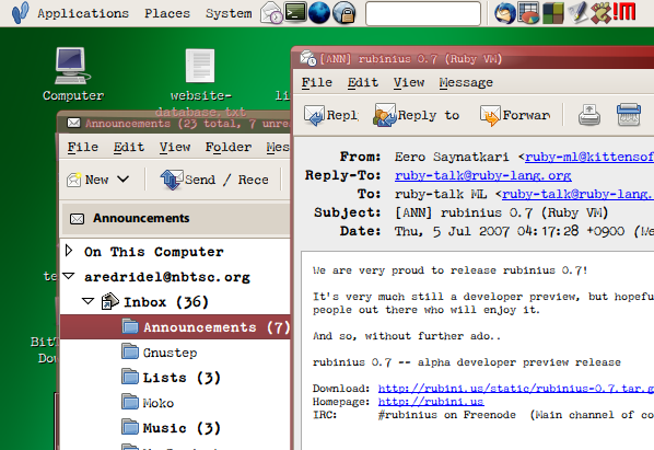
Interface type is used in ways that book type isn’t, and it’s interesting to see how you can play with things. I realized this morning that my terminal type wasn’t letting me distinguish commas from periods easily, so I switched to P22 Typewriter, and despite it being an effect typeface, it turns out to be rather legible for coding. I like the gritty texture, so I tried it for a bit as the Gnome application type:
I like it for the window titles and menu headings. The variation in the letters makes it easier to read in some ways — a bit more visual texture than the Myriad Web I was using before. I’m not sticking with it as application type, since the wide spacing doesn’t let me fit much on the screen, and that’s important to me when reading email, so back to Myriad Web (or maybe Minion Web) for that. The terminal gets to stay old and clunky looking though.
(Yes, that’s the Gnome default wallpaper challenge image in the background.)
